


Am 2. Freitag im April
On the 2nd Friday in April
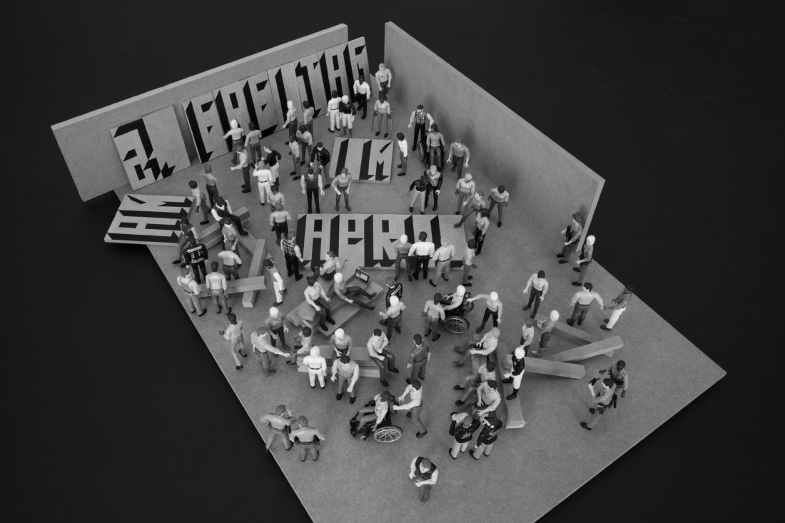
The exhibition title On the 2nd Friday in April is immediately reminiscent of the Date Paintings by On Kawara. His providing of dates allowed him, in a conceptual sense, to transform his life into art by means of time and place, since the painting is also accompanied by the relevant newspaper clipping. Kawara himself was shy of publicity and understood how to locate his personal conditions in the intersection between place, event and duration – a fact that is also inherent in Hofer’s title. After all it was the originally planned opening date of this exhibition, which the artist passed along in this manner so it could be easily remembered, before it suddenly was placed into a new context by an unprecedented epidemic. And so it was not the absent artist who chose the date and place for the portrait of his artistic practice, but the circumstance of a global context – that is still ongoing, and set in motion measures that became necessary overnight, and affected and still affect all of us.
It is always presumptuous to automatically include into the work an event that seems to be occurring independently of the artistic process and choose riding along as a mode of movement. However, the structure of mobility and movement given in this picture reflects the intuitive experiences of urban space of a cartographer like Siggi Hofer. In his drawings he subtly reduces experiences of time and space, that solidify orientation systems into language. This meticulousness – to record in graphic form point by point, statement by statement, action by action – is the central driving force of Siggi Hofer’s understanding of art.
All the more, the now necessary catalogue of measures can be read as a condition and a template for our coexistence within and outside the world of art. The grid becomes the clock frequency of our room to move and a completely new self-experience. The parallel motives of artistic practice and the present condition condense and supplement the narrative of the exhibition. Unplanned, the motif of the green-white-red rose has become a symbol of solidarity with Italy and the current events.
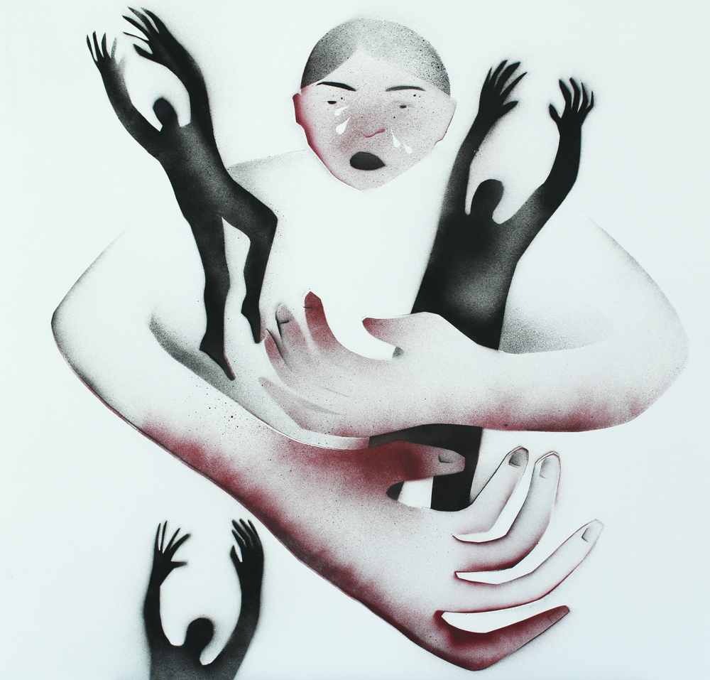
The motif of the rose is not only iconographically charged in its romantic and political scope, but also a childhood memory of the artist going back to his school days in Italy. According to Hofer, there were exercise books that offered motifs to trace and practice drawing. If we look back again, at measures, action and effect that indicate the meticulousness of the artist, we understand the naturalness of Hofer’s position to let the action and the motif intervene in the artistic process. This is supported by the writings distributed on several wooden panels, like come on sister, come on brother or ich will kein Mensch sein (I don’t want to be a human), that alongside the roses achieve performance akin to a recited text. The text fragments turn into mobile protagonists leaning against the wall, that move to the roses as if on a stage and mirror our thoughts as a self-experience of the most recent events. We can not only read the messages directly from the script for ourselves and make them our own, but also carry them through the room, adjust them and combine them anew. If the production of art takes up centrally our quality of identification and distance, this is translated in the most direct and immediate manner to the portable plywood panels during the described time of the lockdown caused by the epidemic. And we nearly forgot that On Kawara is still in the room without ever having been there, since our present, too, rests on textualisations provided, supported and read from the outside.
Karin Pernegger
(Translation: Monika Dittrich)
Linda Reif & Andreas Waldén
This week, each day has held most of the seasons. It’s strange. Not desert strange, but more like airplane interior strange. Hot enough to make your hands sticky, then cold enough to make your wrists hurt. The wind is tangy, bitter, and smells old. The sun’s peeking out from behind its shadow as I’m writing this. The arm of a crane just swung through the frame of the window. It looked like it was pushing the clouds through the sky. Winter has stopped making sense.
Linda makes big dick paintings with the sun. She waits for them to emerge after being baked in chemicals. Each surface is a new beginning and end. Each support a record of the sun’s movement. Some quote tough guy brushwork from postwar New York. Some are monumentally small. Some are narrow and odd shaped. If you put them together, they become characters. Their singular gestures are narrative. Chapters move slowly, stubbornly. Her gallbladder was recently removed. She’s working her way through the photographic lab but has left the lens behind. I don’t really understand how the exposure process works. She says it’s difficult to predict.
Andreas uses lines to mark the time of a support. Color comes and goes, bridges space, and confuses chronology. Each surface is a new beginning and end. They’re descriptive in their touch and build their own past. Some of them look like siblings, fraternal twins even. Some of them don’t. His lines are flat and bunch up into territories. They hover on the surface and shiver. Sometimes they tie space together. Sometimes they separate it and tease perspectival depth. He looks much younger with short hair. Some of his works open up to the architecture that surrounds them. Some are more stubborn and self-contained. I’d like to think his work is about the joy of finding and losing space.
Linda and Andreas work in the same room. They share a bed, kitchen, and bathroom. They watch TV together and speak a foreign language in order to communicate. They adopt shapes and ideas about materiality, surface, and marks from one another, then give them back. The walls of this show are an edited recording of their conversations. It’s not chronological but tracks time.
Seth Weiner
February, 2020
Wien
RECONFIGURATIONS
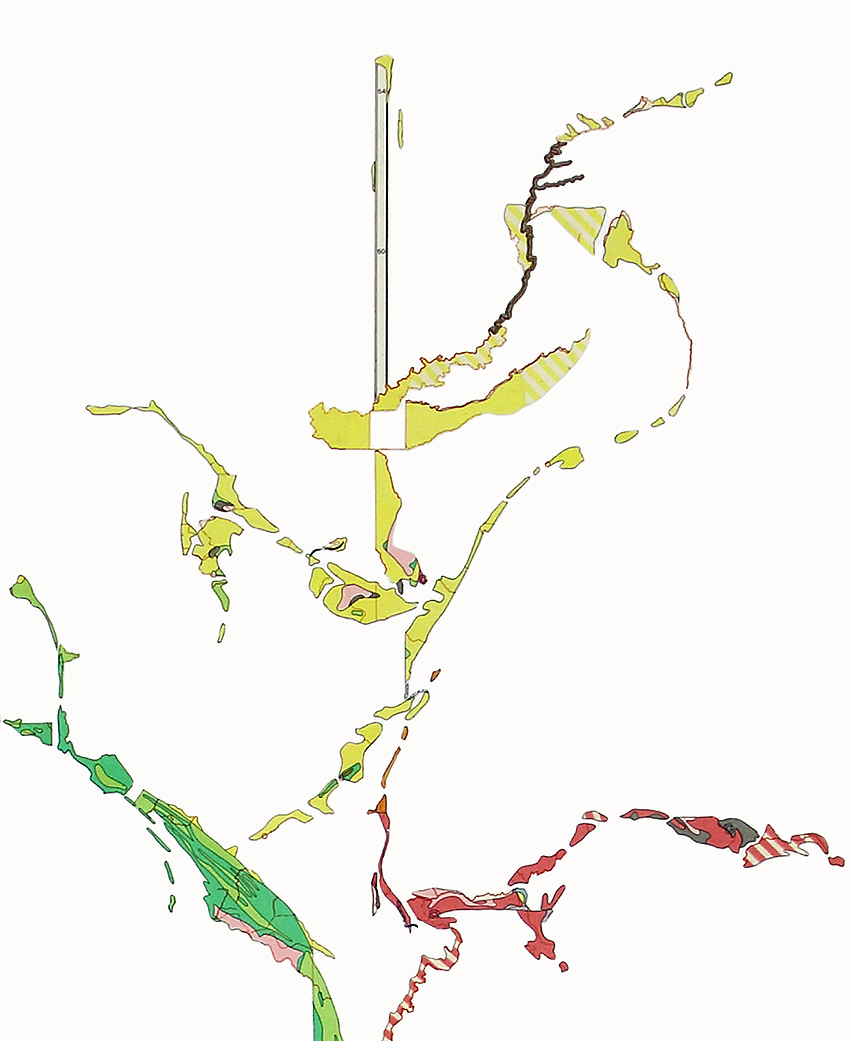
Sophie Dvořák’s works detach geographical-zones and areas from their cartographic composition and focus on former land surveying representations as colored set pieces that are reconfigured. Meticulously dissected elements are put together in collages to form new constellations, the interwoven structures of which serve as a matrix of alienated visualization models and remind of variables of a virtual world. Dvořák questions the existence of cartographic display modes as a “master narrative” of a believed world survey as well as the inherent subjective moments of perspective, which are subject to constant historical and technical changes.
In line with Fredric Jameson’s postmodern and post-industrial subject, experiencing a loss of traditional cartographies due to a constant change of location, Dvořák deals with the horizon of experience that makes the former reading of geographic maps seem obsolete and puts translocal experiences in the foreground of the debate, that lead to a new mapping of terrains that is not only geographical, but above all cognitive. “Under Construction – Atlas van Europa en de Werelddelen”, a work from 2016, takes a Dutch atlas “of Europe and the Continents” from 1967 as a starting point to extrapolate different colored areas from it and translate them into the format of the collage. The rhizomatic arrangement of the individual areas still shows boundaries, which, however, seem to drift into nothing when dissolved. Similar to the Arctic Circle, where all traces threaten to be blurred, Dvořák focuses on moments of a geopolitical shift in reality. Historically, this atlas is a worldview from the Cold War period that has long been considered to be outdated. What remains is a cognitive imagination that two-dimensional cartographies can no longer redeem. These have been expanded by at least one dimension since modules such as Google Earth, making the transition between real and digital imagery increasingly problematic.
Sophie Dvořák takes on the problem of cartographic symbolism and extends it artistically in the exhibition space. In “Reconfigurations” she primarily negotiates graphic elements and colors, as they were once found in atlases. A room with collages, a wooden object and two plasterboards is dedicated to the Dutch Atlas. The yellow arrangement refers to the same areas in the atlas, which are further abstracted and taken from their two-dimensionality, since the views ultimately recur on three-dimensional structures. In the second room, a topographic map of the European territory is enlarged and applied to the wall. Two collages are mounted above it. The reference to geological strata is obvious here, on the other hand the artist tries to intervene, in order to reduce the character of the map and finally to dissolve it in areas and colours. On the opposite wall there is a grid structure, taken from a map measurer, which is used to determine and enter coordinates with angles and inclinations. Next to it, graphical representations are added, taking up mathematical and geometric methods of map projections.
Dvořák alternates between factuality and visuality, which are transferred into the pictorial space as artistically negotiated tropes. Her work thus leads to a contemplation of moments in a debate on reality that is always subject to the power of visual definition. Statistical and systematic measurement errors must be taken into account here as well as their visual interpretation in an artistic-discursive world.
Walter Seidl
Bei uns
Spuren der Diskriminierung im urbanen Raum
Hana Usuis Semiotik der Ausgrenzung
“An artless truth about an evil, about a vulgarity, is an evil, a vulgarity. She has to be valuable to herself: then she balances the evil, reconciled with the hurt the victim suffers, and the pain of having evil.” Karl Kraus
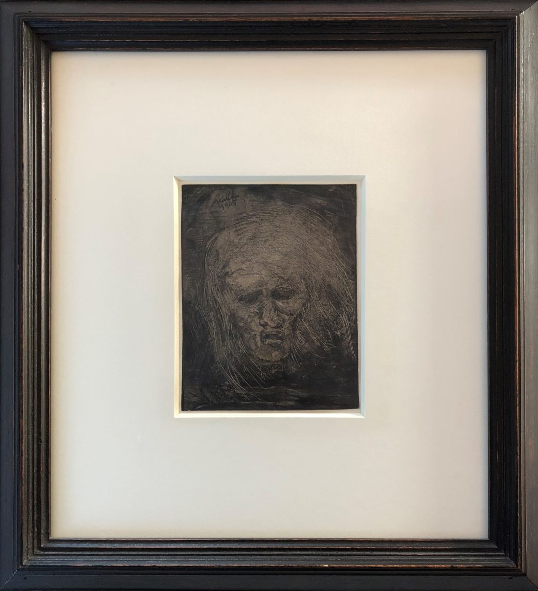
With “Bei uns”, her first solo exhibition at WOP – Works on Paper, Hana Usui (born 1974, Tokyo) continues her work on political and sociocritical issues, which she started in 2014. In the works that have emerged since then, she takes up her long-standing practice of abstract drawing, but always looks for new ways and forms to reflect difficult topics that move her personally. In doing so, Usui does not act in a frontal or merely documentary manner, but creates ciphered and elaborate works that broaden their artistic practice towards sculpture or photography.
Hana Usui was born in Tokyo in 1974 and studied calligraphy with famous Japanese masters as a child. In 1999 she dissolves completely from the character and works only on image surfaces with ink, otherwise with oil paint. For the oil breaks in “from us” she uses a technique that she has developed herself, which allows her to draw with a screwdriver by firmly pressing the paper on an oil-painted surface to create forms. Usui’s works are part of important international collections such as the Albertina, the Museum der Moderne in Salzburg or the Staatliche Museen zu Berlin.
Dr. Klaus Speidel
No Man Is Big Enough for My Arms
Curated by Goschka Gawlik
Karolina Jablonska, one of the best-known young representatives of new painting in Poland, completed her Master’s thesis at the Academy of Fine Arts in Krakow three years ago and has since dynamically developed her career as an artist step by step. She works individually as well as in collaborative practice. She is no “exceptional woman” in a Krakow artist trio which operates a gallery and a publishing house as well as collaboratively curates exhibitions and, evoking its success, calls itself Potencja (potency). Potencja, active since 2012, has long conquered the local art scene with its performative activities and dark, image-rich formats.
In the Vienna gallery Works on Paper, the brilliant painter shows her graphic works, which she creates parallel to her painting. In her painting as well as in her works on paper the human figure is dominant and a memorable style – an oscillation between bold pop-art-like expression, folksy simplification of the opulent forms as well as a play with vertigo-inducing perspective, which always functions like a monstrous magnifying glass. The focus of Jablonska’s works on paper, which she herself describes as “in the dark”, are, in torturous slow motion, motifs of violence, sexual desire, rivalry and erotic intimacy, subjects, therefore, which the previous generation of painters has avoided, or has not given such drastic, irritating, subjective form. Her early paintings already referenced various models of femaleness from art history (Rousseau, Munch, Gentileschi), whose output Jablonska counters in an endless loop (reflecting the asymmetrical balance of the genders), sometimes humorously with nods to kitsch, fables, selfies or other pop-cultural image creation. Not least, in Jablonska’s home, fairly recently women took to the streets a number of times dressed in black and carrying black umbrellas in order to advocate for their rights and protest against outside control over their bodies. Oftentimes the faces of the artist’s figures are covered by stocking masks or are hardly visible, but fixedly staring eyes or wide open mouths pop out of the dark, which emphasise the subjects’ anonymity in support of their milieu-specific actions. That way, Jablonska creates an impression of subversive rebellion against any kind of superior exertion of power as well as against male abuse of women in particular. Sometimes, her work can also only be about aspects of ritual fights for survival. The spatial distortions and disconcerting close-ups of the figures as well as the dramatised fragmentation of the bodies and the placement of the smaller works in small black glass boxes – as if embedded in a screen – marks the shift of visual power from the physical to the digital world.
In the currently shown works Jablonska mostly uses stencils, which she expertly works with applying a spray in differentiated shades of black-grey and occasionally the colour pink as an addition. Her memorable images are grotesque and poetic, brutal and delicate, conventional and experimental at once. In them, the painter addresses the existential conflicts of young people and their dubious moods and ambiguity going as far as distressing excesses of violence, angry outbursts and unexpected spook actions. The flowing bodies and their smooth surface appearance that appeals to the senses and wants to be seen have evolved from the influence of the visual communication in social media between love, care and body horror in digital capitalism and seem to be of an oral rather than image-immanent character. Following this, the ontology of Jablonska’s image worlds with their profusion of contents with a signal character and circulating forms, which listen to the oblique associations and painful feelings, fluctuating and flickering. The meanings resulting from them, too, are ephemeral and temporary. Their messages or visual language rather resemble relations in digital social networks than purely behaviourist acting patterns in the “real world”. And despite this contradiction we perceive Jablonska’s visions as more real than they themselves are.
In her works the painter does not strictly bind herself to feminist breeding: rather, the explosion of (antagonistic) emotions and her inner fire are directed against any form of oppression and aggression and support a better now. For her works on paper and collaged video loops, which are currently shown, the artist appropriates as a reference the title of a pop song that she once heard on the radio. “No man is big enough for my arms” is a quote by Suzanne Mallouk, the partner of Jean-Michel Basquiat, which in the song by the French-Cuban, feminist twin duo Ibey is an expression of confidence in a better future. Despite the admiration of a belief in the causal power of many honourable attitudes and intentions (including the artistic) it is difficult to always live up to them in life, which, as Jablonska notes, leads to confrontation, violence, hate speech and other bitter disappointments. These emotional tensions are recounted in her work, modifyingly in allusion to the present image-creation technique of selfies. It gives her form of expression a new impulse, which manifests in a broad range of facial expressions, poses and gestures, which are semantically with their predecessors from art history, pop and celebrity culture condensed, filtered and heightened into artefacts.
Goschka Gawlik
Translation: Monika Dittrich
Primary Structures
“What you see is what you see.”
Frank Stella, New Art, 1966
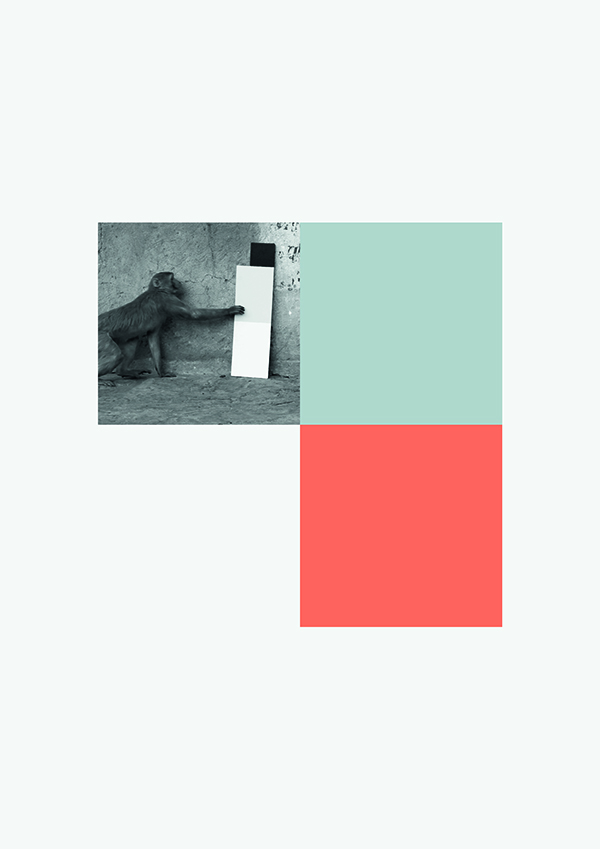
In his works, Kay Walkowiak often explores different cultural approaches to art, although he does not intend to draw comparisons, but demonstrates that concepts taken for granted in one cultural environment are received entirely differently in others. In 2014 Walkowiak brought art objects primarily presented in the Western museum space to a culture with a completely different aesthetic perspective. During travels to India, he presented macaques with minimalistically painted boards. The animals’ reactions to the works were captured in the film “Stimuli” (Full HD video | 16:9 | 2.22 min. | Color | Sound). It is a humorous investigation of the perception of minimalism and the reception as well as interpretation of art. The traditional circumstances require a detached, rational and analytical reception of art, completely opposed to the monkeys’ behavior that is in part directed by affect, far from any intellectual reflection.
A large number of potential recipients is deterred by the often complex scholarly interpretion of art and as a consequence avoids engaging with contemporary art. Walkowiak, however, reminds the audience that the works of art do not invariably require this cumbersome interpretation and it can be led ad absurdum. The constructivism of the modern era, formalism and minimal art are partly characterised by geometric arrangements without layers of meaning. Still, recipients have been encouraged by the shapes to generate metaphysical dimensions to the artwork. Form was used as expression of intellect, to add meaning to simplification after the fact. Walkowiak’s critique addresses this phenomenon. He creates objects that represent nothing but themselves.
Following this thought, he likes to use geometric elements in his art, because form is only a concept that does not carry any meaning. Still the observer will try to project meaning onto the geometry. This aspect of humans’ constant longing to find meaning is thus bluntly exposed by Walkowiak.
This is the foundation of the serial work “Primary Structures” (archival pigment print on Fine Art Photo Rag). The performative in “Stimuli” was documented in black and white photographs. The compositions are multi-part works of art with regular variations. In an academic reading, the geometric form of the square could be practically tortured. A square canvas is divided: two single colour squares and one photograph as well as one empty square make up each work. These parts are constant, they are only accentuated by a change in their arrangement. Every square in the works can be received independently. From the perspective of art theory, the question arises whether and how the coloured squares should be perceived – as a spatial construct? This is mostly achieved by the contrast effect of colours, the dynamic of which might even create emotions. However, owing to the arrangement of the colour squares there can be no depth or even space. Apparently in complete accordance with the wishes of the artist, the search for a meta layer to the colour composition ends in failure. The three printed squares are, in their number, a reflection of the 3-part boards that the macaques are handling in the photos. The missing forth image element emancipates itself out of the arrangement of the other squares and assumes a creative character as a negative form; it is both a square hole in the composition and a square part of the artwork.
All separate works in „Primary Structures“ make up a complete concept. The series is read like a story by the recipient – the performative moment comes through again here. The coloured squares are in a formal relationship with the black and white photographs: The monkey is the recipient of the art object in the photograph. The viewer of “Primary Structures” itself can receive this moment together with the coloured squares that make him – just like the animals – a consumer of these subject-less works of art and consequently question his very act in that moment.
Lucia Klee-Beck
(Translation: Monika Dittrich)